
A patient with a cracked incisor pulls up your site from her car in an urgent-care parking lot, thumb ready to hit back. She has seconds to find a same-day option before she calls the practice down the street. This page fixes that math.

Emergency patients and implant patients are not the same person, and one homepage cannot serve both.
When every procedure shares the same page, the patient mid-comparison leaves without calling because nothing on the page speaks directly to the decision she is already making. The fix is not a redesign, it is knowing which pages are losing patients right now and why, before you touch anything.

A patient with a cracked molar at 7am and a parent booking a six-month recall are not in the same headspace, and your site's front door cannot speak to both at once. When one homepage tries to serve every intent, the emergency patient can't find your same-day slot and leaves. The recall patient sees implant promotions and wonders whether this is even a general practice.
Each intent needs its own path from the first click: a persistent emergency banner that routes to a same-day booking form, a hygiene entry point tied to your patient portal, and a cosmetic gateway that begins education before it asks for contact details. Deciding what to attract also means deciding what to name clearly. "Comprehensive dental care" tells no one anything. "Same-day crown, no second visit" tells the right person exactly where they are.
Before you restructure anything, review which dental lines to prioritize first so the site architecture follows the procedures that actually fill the schedule in your market.
A patient comparing a single implant to a bridge is weighing bone volume, healing time, and a surgical placement visit. A patient comparing Invisalign to clear aligners from a competitor is weighing refinement frequency and clinical oversight. These are entirely different decisions, and a generic "cosmetic services" dropdown serves neither conversation.
Good dental web design isolates each procedure into its own page with the comparison that patient actually arrives with already answered. Full-arch cases deserve content that addresses candidacy criteria, phased treatment timelines, and what the extraction-to-loading interval looks like. Veneer pages need to separate preparation cases from no-prep options. Invisalign pages should distinguish mild crowding from more complex bite correction, so the right patient self-selects before calling. When all four procedures live on one scrolling services page, the patient who needs the most guidance leaves with the least.
Before any dental web design project touches a template or color palette, pull your last 90 days of analytics: traffic source, landing page, and the drop-off point. Owners who run this audit tend to surface one of three problems, and each calls for a different fix. Weak demand means almost no one is searching for what you offer in your area, and page redesign alone won't move the needle. Poor fit means traffic lands but bounces immediately, usually because the page headline doesn't match the search intent that sent them there. Poor conversion means visitors stay but don't act, which points to missing proof, buried contact options, or a form that asks too much too early.
Run this audit page by page, not site-wide. Your implant page and your cleaning page fail for different reasons. If you have a professional dental website already live, the data already sitting in Google Search Console will separate a demand gap from a design gap in under an hour. Deciding what to fix first, and on which page, is the only way to make a redesign investment return anything measurable. Reviewing dentist seo keywords alongside search console data separates a demand gap from a design gap.
Most treatment pages describe a procedure. Patients don't arrive needing a description: they arrive mid-comparison. The veneer patient has already watched preparation videos and wants to know whether you offer no-prep options and how long they last. The Invisalign patient has a quote from a competitor and wants to understand what additional refinements cost.
A page that answers those comparisons before the phone rings converts better than one built around clinical definitions. Structure each treatment page so the first screen addresses the comparison the patient is already running, the second addresses candidacy, and the third handles next steps. When page structure also needs to serve organic search, the question of how those pages rank and which terms they target is a separate discipline: a deeper search plan for dental service pages handles that without pulling this content strategy off course.
Sedation information placed on a routine cleaning page introduces anxiety where none existed. Financing options buried three pages deep don't help the full-arch patient who needed to see them before deciding whether to book a consult. Placement, not the presence of the information itself, is where most sites go wrong.
Attach sedation details to pages where procedure anxiety is real: oral surgery, implants, extensive restorative work. Attach financing to pages where case size is a genuine barrier. Candidacy criteria belong at the top of implant and cosmetic pages, not at the bottom after a long description, because a patient who disqualifies herself early doesn't waste your consult slot or her time. Every supporting detail earns its place by serving the booking decision on that specific page.
A new patient page that lists every procedure you offer is quietly competing with your treatment pages for the same visitor. Its job is narrower: answer the four questions a new patient has before calling. Where are you, what do I bring, how do insurances work here, and what happens at the first visit?
Insurance pages perform best when they name the plans you accept plainly and acknowledge what "in-network" actually means for out-of-pocket cost, because that is the question patients are really asking. Location pages with embedded maps, parking notes, and transit directions reduce no-shows more reliably than design changes to these pages ever will. Keep these pages lean and functional: friction on the path to booking costs you appointments that your treatment content already earned.
An emergency patient with a swollen jaw will call. A patient who just finished reading your full-arch page at lunch will send a form request and expect a same-day response. A cosmetic patient who is still deciding whether to book a consultation wants text: it's lower commitment than a call and leaves her in control of the pacing.
Your contact options should reflect those different pressures. An emergency banner needs a tap-to-call number front and center, not a form. Cosmetic and implant pages convert better with a short consult-request form and a visible text option alongside the phone number. Routing these correctly means fewer abandoned contacts and fewer cases where a willing patient simply didn't find the method that suited them.
When a patient has to navigate three pages to find your Saturday hours, you have already introduced doubt. The patient wondering whether you're open on weekends is also wondering whether your practice is organized enough to manage her care.
On mobile, hours and directions should be reachable from the homepage in two taps. New patient forms should be downloadable from the appointment confirmation page, not only from a buried patient resources tab. The booking form itself should ask for name, preferred service, and contact method, nothing more at the first touch. Longer intake forms belong after the appointment is confirmed, not before it is made. Friction at the contact stage is the most preventable source of lost consults in dental web design.
A patient deciding between two implant practices with similar pricing will spend more time on the one where she can see the surgeon's face, read a brief biography that mentions implant fellowship training, and view the actual operatory where the procedure happens. Stock photography of bright teeth on a white background offers none of that information.
Real team photos signal that the practice is stable and the clinicians are accessible. Credentials presented in plain language (not just a string of abbreviations) answer the implicit question: is this person qualified for what I need? Office images that show a clean, organized environment reduce the first-visit anxiety that delays booking. These assets are also compliant by nature: they make no clinical promise and require no disclaimer. They simply show what's there.
A veneer gallery proves shade matching and proportionality. Patients comparing porcelain options look for natural translucency and gumline symmetry in the after images, not just whiteness. An Invisalign gallery should show mild-to-moderate crowding cases separately from more complex bite corrections, because a patient with a single rotated lateral incisor should not have to wade through full-arch movement cases to find something that reflects her situation.
Full-arch before and afters carry the heaviest compliance weight: they imply outcomes, which means your captions need to describe the procedure accurately without suggesting guaranteed results. Most state dental boards require some form of disclaimer language on patient case galleries, so verify your jurisdiction's requirements before posting. The galleries that convert best are the ones where the case shown matches the case the page is designed to attract. How review content can support these galleries without duplicating compliance risk is a separate question: how reviews support treatment pages addresses that boundary directly.
A site that generates more calls is not automatically a better-performing site. The measure that matters is where in the care sequence those contacts convert: a call that books a cleaning is a different outcome from a form submission that books an implant consult that becomes an accepted full-arch treatment plan. These are not interchangeable, and aggregating them into a single "leads" count hides whether your dental web design is actually working for your higher-complexity procedures.
Tracking by service line requires a modest setup: phone tracking numbers assigned per page or per campaign source, form submissions tagged by the page they originate from, and a simple count of consults booked and treatment accepted at the front desk, recorded weekly. You do not need a complicated dashboard. You need those four numbers, separated by procedure category, reviewed on a monthly basis. If implant consult volume is flat while cleaning bookings are climbing, the implant pages are the problem, and that is exactly what a redesign should target next. Splitting measurement this way also reveals whether a dip in total contacts is a site problem or a demand problem in your market.
Homepage changes affect every visitor immediately: a clearer headline, a faster load on mobile, a more visible booking path. When your homepage was the conversion barrier, the effect shows up in the next few weeks of contact volume. Implant and cosmetic pages work on a different timeline because the patient making that decision cycles through more research before submitting anything.
A patient considering full-arch restoration may visit your site three or four times over several weeks before requesting a consult. That means a page-level redesign for implants takes longer to prove out in the data, not because the page is underperforming but because the decision cycle is longer. Build your reporting window accordingly: hold homepage performance to a short review cycle, and give treatment pages a longer evaluation period before drawing conclusions. The practice that stops iterating on implant pages after six weeks because nothing moved yet is usually the one that rebuilt the right page but measured it against the wrong timeline.
Open your analytics today and count how many implant or cosmetic page visitors submitted a contact form last month.
We review your pages, search visibility and enquiry path, then show you what to fix first.
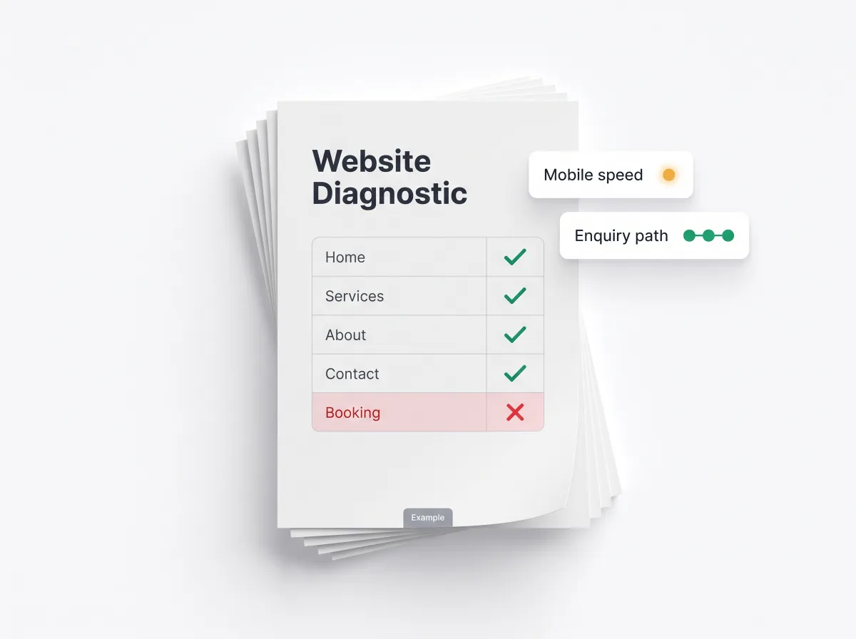
You have read how a dental site should guide a patient to booking. We review your own pages and show where implant, cosmetic and emergency visitors stop.
.svg)