.svg)

Your website might be quietly losing patients every single day.
In seconds, parents decide if you feel clear, modern, and safe or confusing and risky. A calm layout, simple menu, and strong photos of your real team can quickly turn casual visitors into booked consults.
Most parents first find you on their phone. If they cannot call or book in one or two taps, they leave. Fast pages, short forms, clear buttons, and helpful content (like FAQs and before and after stories) work together to win trust and fill your schedule.
Pick one small change from this list and do it today so your website starts working like a quiet, steady referral source for your practice.
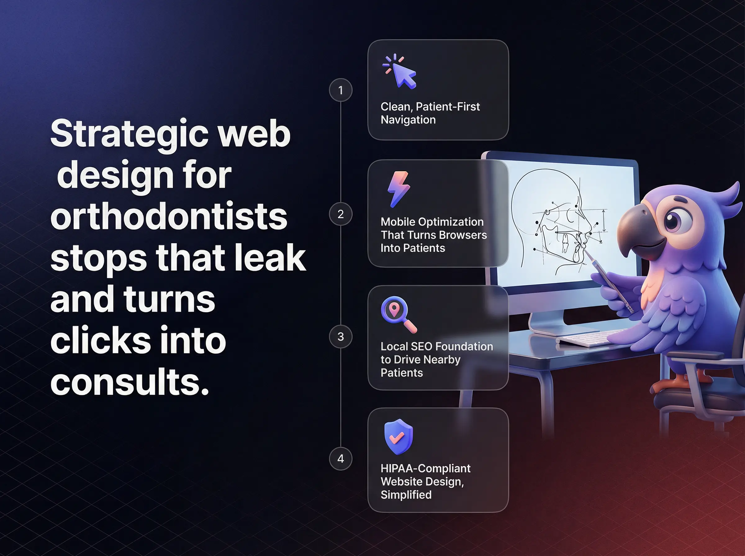
Most orthodontic websites quietly leak patients every single day.
Strategic web design for orthodontists stops that leak and turns clicks into consults.
Patients now judge your entire practice in seconds based on what they see online.
If your orthodontist website design feels confusing, dated, or slow, prospective patients move on without ever calling.
The right digital experience positions your practice as the safest, easiest, and most trusted choice in their area.
That is why every element on your site needs to work together for trust, clarity, and simple conversion.
From navigation and branding to HIPAA compliance and performance, each part either builds momentum or creates friction.
The goal is an orthodontic website that quietly does the heavy lifting for your front desk.
Patients should never wonder where to click next.
They should feel guided, reassured, and ready to book in under a minute.
Modern web design for orthodontists is not about flashy graphics.
It is about building a friction free path from first impression to scheduled consultation.
Competitor sites that consistently convert do this by combining intuitive navigation, generous white space, and clear calls to action.
When those pieces are missing, patients feel lost.
They scroll past services, miss insurance details, and abandon forms halfway through.
Internally, this looks like empty appointment slots, more price shoppers, and inconsistent new patient flow.
Clean structure and thoughtful layout change that emotional experience.
Visitors feel calmer, more informed, and more confident that your team is organized and professional.
That feeling directly shapes whether they trust your practice with a long treatment journey.
If a parent has to hunt for your phone number, your site is already losing.
Patient first navigation brings key actions to the surface in a predictable, simple way.
High performing orthodontic sites align their menus with real questions patients ask.
Sections like Treatments, New Patients, Insurance and Financing, About, and Contact are visible in one glance.
Important actions such as Schedule Consultation or Call Now appear consistently in the header and hero section.
This clarity reduces anxiety for parents comparing multiple providers on a lunch break.
It signals that your processes are just as organized as your menu.
Navigation that follows Delmain and CyberOptik style guidance creates trust before a single word is read.
A recommended approach for healthcare business owners is to audit the main menu with non clinical staff.
Ask them to book an appointment in under three clicks and adjust labels until that path feels effortless.
Clutter on a medical site feels like clutter in a waiting room.
Patients equate visual chaos with operational chaos.
Strategic white space creates breathing room around your most important elements.
Instead of stacking text, images, and badges tightly together, strong layouts let one message dominate each screen.
This improves readability and draws the eye naturally toward CTAs such as Request an Appointment.
Competitors highlighted by CyberOptik and Simple Impact Media use white space as a silent guide.
Headline, patient friendly copy, one key visual, and a clear button sit in a spacious hero section.
Below, short sections explain treatments, financing, and reviews without overwhelming the visitor.
The emotional impact is subtle but powerful.
Parents feel that your practice is calm, controlled, and focused on what matters most for their family.
Clean structure, clear navigation, and generous white space quietly turn confusion into booked consults.
Most parents discover orthodontists on a phone, not a laptop.
If your site frustrates them on mobile, they never become patients.
Leading orthodontist website design now starts with mobile first thinking.
The layout, booking options, and contact elements must feel built for thumbs, short attention spans, and spotty connections.
Competitors winning in local search pair responsive design with simple, persistent conversion paths on small screens.
On mobile, every extra step costs you inquiries.
One tap actions turn interest into booked visits before distraction appears.
High performing sites feature click to call phone numbers at the top of every page.
Buttons open fast mobile friendly forms that ask only essential information.
Sticky CTAs such as Call Now or Book Consultation stay visible as visitors scroll.
This reduces friction at exactly the moment a parent decides to act.
Instead of copying a number or searching for a form, they tap once and move forward.
The emotional shift is clear, from frustration to relief.
Your brand should feel consistent on every screen size.
That requires more than shrinking a desktop site.
Effective responsive design rearranges content to follow a mobile friendly hierarchy.
Hero images compress without losing quality, text stays readable, and key CTAs sit inside the natural thumb zone at the bottom half of the screen.
Page sections stack in a logical order so that benefits, social proof, and next steps appear before long detail blocks.
When this is done well, parents never need to pinch, zoom, or guess where to look.
They simply scroll, understand, and act.
That smooth journey is one of the strongest silent sales tools your practice can have.
The best looking site still fails if no one can find it.
Local SEO turns your website into a steady source of nearby patients.
Search engines reward orthodontic sites that clearly explain who they serve, what they offer, and where they are located.
This is where on page keywords and structured data become essential.
Handled correctly, they help your practice appear in map packs, local queries, and high intent searches.
Keywords should support clarity, not clutter copy.
They work best when they mirror how patients actually search.
Strong orthodontist pages naturally include terms such as braces, clear aligners, and orthodontist, paired with city or neighborhood names.
These appear in headings, title tags, meta descriptions, alt text, and throughout service pages in plain language.
This approach aligns with CyberOptik style guidance on capturing neighborhood level searches.
Used well, phrases like web design for orthodontists and orthodontist website design can also help signal relevance to search engines for your own marketing efforts.
The key is balance and readability, never stuffing.
Search engines understand structure as much as they understand words.
Schema markup gives them that structure.
By adding structured data such as Dentist or MedicalOrganization schema, your site can qualify for rich results.
These may include star ratings, map visibility, operating hours, and other enhanced details directly in search results.
Guidance similar to Simple Impact Media style best practices helps ensure this is implemented cleanly.
The outcome is more than technical improvement.
Parents scanning results see proof of professionalism, reviews, and location before they even click.
Trust can vanish the moment a form feels unsafe.
HIPAA conscious design protects both patients and your reputation.
Compliance does not need to feel complicated.
With the right tools and workflows, your site can collect information securely without slowing down the patient journey.
Competitor checklists from groups such as My Social Practice and CyberOptik show that small details make a big difference.
Every patient facing form should signal security on sight.
That starts with HTTPS and a valid SSL certificate across your domain.
Contact and intake forms must use encryption in transit.
Submissions should never route through unencrypted email inboxes.
Clear microcopy such as Your information is transmitted securely reassures visitors as they type.
This combination of technical protection and visible reassurance reduces hesitation, particularly when forms ask for health or insurance details.
Compliance is not only about forms, it is about where data travels next.
Routing must be intentional.
Best practice is to connect website forms to HIPAA compliant CRMs or patient intake platforms.
These tools manage protected health information with encryption, access controls, and audit trails.
Embedded workflows can still feel seamless to the patient while quietly meeting regulatory standards.
This approach prevents staff from relying on ad hoc solutions such as forwarding form fills through standard email.
It protects your practice while preserving a smooth, digital first intake experience.
Most visitors are interested but undecided.
Effective CTAs give them a simple next step at the exact right moment.
Orthodontic sites that convert well use short, friendly, and specific language.
Design and placement then reinforce that message without distraction.
Insights from Delmain and CyberOptik show that small changes here can unlock significant growth.
Generic buttons like Submit rarely inspire action.
Specific invitations do.
Proven examples include phrases such as Book Your Free Consultation, Schedule Your First Visit, or See If You Qualify For Clear Aligners.
Each ties directly to a patient desire, whether it is saving money, starting quickly, or exploring options.
The tone stays warm and low pressure, which is crucial for parents still comparing providers.
Testing two or three variations over time is one of the fastest ways to improve conversion without redesigning an entire page.
Even the best CTA copy fails if visitors never see it.
Placement patterns matter.
High converting layouts place a primary CTA in the hero section, again after key benefit sections, and close to financing or reviews content.
Heatmap studies used by leading agencies show that consistent positioning helps visitors act without thinking.
Buttons stand out with clear contrast but still align with your brand colors.
The result is a natural flow.
Learn, feel reassured, then click.
Patients cannot feel your office from a screen, but they can sense your brand.
Visuals and color tell a trust story in seconds.
Strong orthodontic branding makes visitors feel safe, welcome, and confident that your team delivers precise, modern care.
Photography, video, and color all combine to create that emotional signal.
Stock photos rarely build real trust.
Authentic, high quality visuals do.
Leading practices invest in professional photography of the team, technology, and welcoming office spaces.
Short testimonial videos featuring real patients, recorded with consent and privacy safeguards, add powerful social proof.
These assets mirror best practices highlighted by CyberOptik and Delmain for credibility focused sites.
When visitors can see smiling staff and real outcomes, the distance between website visit and phone call shrinks dramatically.
Color is not decoration, it is a trust signal.
Medical audiences are sensitive to it, often without realizing why.
Light, airy palettes with soft blues, greens, and neutrals tend to communicate cleanliness, calm, and professionalism.
Accent colors draw attention to CTAs without overwhelming the page.
Consistent use of these tones across your site, forms, and patient materials reinforces brand recognition.
This consistency mirrors what parents hope to see in your clinical care, steady and reliable at every touchpoint.
A slow site feels like a busy waiting room.
Patients leave before they meet your team.
Performance metrics such as Core Web Vitals translate directly into patient experience and SEO outcomes.
Simple Impact Media style guidance shows that shaving seconds from load times can produce clear gains in conversion and rankings.
Three numbers deserve special attention.
Largest Contentful Paint, Interaction to Next Paint, and Cumulative Layout Shift.
LCP tracks how quickly the main content appears.
INP measures how responsive your site feels when visitors tap or click.
CLS watches for layout jumps that cause misclicks.
Improving these scores with image optimization, clean code, and smart hosting makes your site feel smoother and more trustworthy.
On mobile, even a two second delay can cost conversions.
Parents rarely wait.
Fast orthodontic sites compress images, control third party scripts, and use content delivery networks to push assets closer to visitors.
They avoid auto playing heavy videos above the fold and limit complex effects that slow initial paint.
The experience feels instant, which supports both SEO and patient satisfaction.
Patients do not just want a provider, they want answers.
Content marketing delivers those answers at scale.
Blogs, FAQs, and case studies help your site rank for specific questions while building authority and trust.
CyberOptik and My Social Practice style strategies show that consistent, educational content pays off over time.
Strong blog calendars start with patient questions.
Not abstract keywords.
Topics might cover treatment timelines, options for adults, what to expect at the first visit, or how insurance typically applies.
Each post should be written in clear language, with a simple CTA guiding readers to schedule or contact your team.
Over time, this library becomes a powerful organic traffic driver and a resource for your front desk to share.
Few assets are more persuasive than real transformation stories handled with privacy in mind.
They turn abstract promises into visible outcomes.
HIPAA safe before and after galleries, combined with short written case summaries, show visitors what is possible.
Focus on goals, process highlights, and final results rather than personal details.
This aligns with CyberOptik style trust building content while respecting compliance.
Parents who see patients like their own children represented on your site feel understood and reassured.
A winning orthodontist website design blends trust, speed, compliance, and clear strategy.
Which piece of your digital experience, if improved next, would create the biggest lift in new patient confidence and conversions?
Launch a patient-winning orthodontic website now. Book a free strategy consult and turn web traffic into appointments.
I now help healthcare providers build predictable patient acquisition systems.
I write about healthcare growth, high-value patient funnels, and what actually works in today’s digital landscape.
Follow me👇
.svg)
