.svg)

Your website is now your real front desk, and patients decide in seconds if they trust you.
A clear, fast site that works on phones, shows real photos, easy booking, and simple forms will quietly bring in more of the right patients. Small fixes in navigation, speed, local content, and online scheduling can lift new patient numbers without more ads.
✔ Ask 3 people to find “Book appointment” and insurance info on your site in under 30 seconds
✔ Run a quick mobile speed test and compress slow, large images
✔ Replace 3 stock photos with real photos of your team and office
Pick one of these steps and do it this week so your website can start working like a 24/7 front desk that wins patient trust.
Patients decide in seconds if your practice feels trustworthy.
Your dental website design often makes that decision for them.
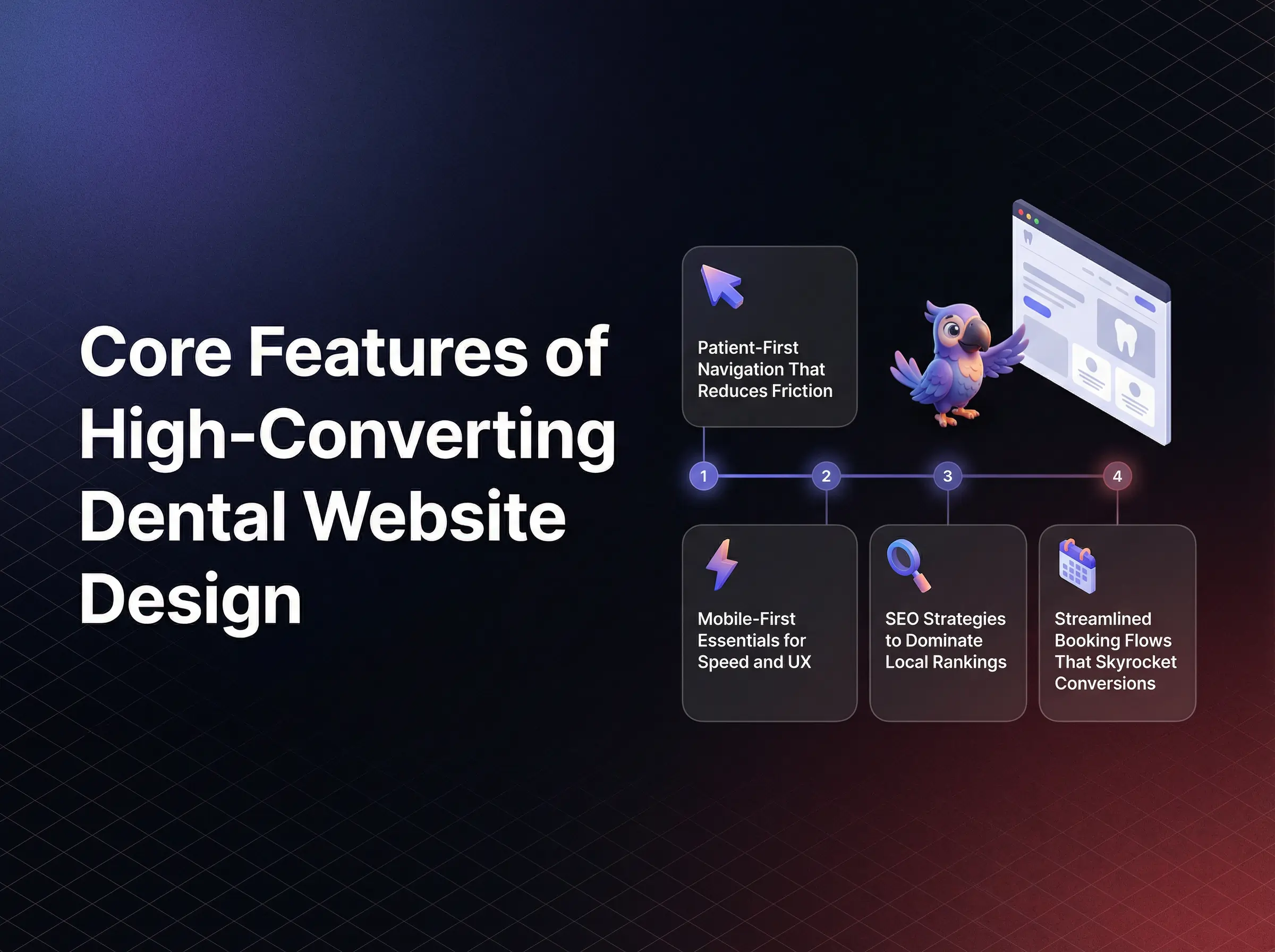
High performing dental website design is now a primary driver of new patient flow, referral confidence, and case acceptance.
If your site feels dated, confusing, or slow, local competitors that invest in modern UX quietly capture the demand you worked hard to create.
That shift affects practices of every size, from solo locations to multi site groups.
Behind every missed call and abandoned form is a real person who wanted care but hit digital friction and gave up.
Cluttered layouts make patients feel rushed and overwhelmed before they ever enter the office.
Slow loading pages signal neglect and create a subtle sense that clinical care might be just as outdated.
Confusing navigation, buried contact details, or broken online scheduling leave front desk teams drowning in calls and follow ups that could have been automated.
That frustration is shared by marketing teams that see ad spend wasted on landing pages that look polished but fail to guide visitors into actual bookings.
The strongest dental websites do something very different.
They feel simple, intuitive, and calm from the first scroll.
They prioritize the patient journey over internal office preferences.
They reduce clicks, questions, and uncertainty at every step and as a result, they convert at a much higher rate without extra advertising costs.
A recommended approach for healthcare business leaders is to treat the website as a digital front desk that must serve patients clearly at all hours, not as a static brochure.
Modern dental website design is a 24 7 digital front desk that must feel simple, safe, and fast for every patient.
If your site already looks modern, yet growth feels flat, the issue is rarely only aesthetics.
The hidden gaps usually live in UX details, local SEO signals, security friction, and weak conversion paths.
Each area below targets one of those silent gaps and shows how to turn it into an advantage.
Small UX tweaks can double conversions without changing your ad budget.
Most practices leave that leverage on the table.
Core UX and mobile first principles decide if visitors feel guided or lost.
Patients land on your homepage, glance at the header, and instantly judge how easy it will be to find what they need.
Layouts inspired by high performing healthcare sites give your practice an immediate edge in trust and clarity.
When navigation is messy, new visitors bounce even if they live five minutes away.
They click on vague menu labels, struggle to find insurance details or services, and abandon the visit with more questions than answers.
On mobile, cramped text and tiny buttons make it physically uncomfortable to book, which feels like your practice is hard to work with.
Patients remember that feeling long after they forget your name.
High converting sites use patient first navigation that removes guesswork.
Clear menu labels like Services, Insurance, and New Patients mirror how people actually think and search.
Sticky headers keep core actions like Call and Book Appointment visible as patients scroll through services and testimonials.
Minimal service menus prevent decision fatigue and gently direct visitors toward the most profitable or common procedures.
Mobile first performance is equally critical.
Responsive frameworks, image compression, and Core Web Vitals optimization ensure pages load in seconds, not in frustrating delays.
Patients equate fast sites with organized practices and slow sites with backlogged, hard to reach offices.
Speed becomes an emotional trust signal, not just a technical metric.
Before investing in a redesign, it helps to ask one question.
Could a distracted parent, standing in a grocery line with one free hand, book for their child on your site in under 60 seconds?
To move forward, review your current navigation labels, header layout, and mobile load times, then decide which single change would remove the most friction for new visitors this quarter.
The fastest way to lose a ready patient is to hide what they came to find.
Navigation is usually where that loss occurs.
Patient first navigation treats every label and click as guidance, not decoration.
It gives immediate paths to Book, Call, Services, and Locations without clever wording or internal jargon.
This clarity lowers anxiety and makes your brand feel calm and in control.
Heatmap studies in healthcare consistently show visitors gravitating to the top right header and the first screen of the homepage.
When those areas are filled with vague links instead of clear actions, people wander, then leave.
By contrast, simple labels, a visible phone number, and a primary Book button create a sense of relief for rushed visitors.
The real value is that intuitive navigation reduces calls for basic questions and lets your team focus on higher value patient conversations.
It also increases the conversion rate from every marketing channel that touches your site.
As you refine your menu, ask how quickly a new visitor could understand where to click if they only skim for three seconds.
Consider reviewing your header with your front desk staff and asking where callers most often get confused, then mirroring those answers in your menu labels.
Your next high value patient is probably browsing on a phone, not a desktop.
Mobile performance shapes their first impression.
Mobile first design means pages adapt smoothly to small screens, buttons stay large enough to tap, and forms are simple to complete with thumbs.
When combined with fast hosting, compressed images, and lean code, this creates a site that feels effortless to use.
Slow mobile load times are not just inconvenient.
They trigger distrust, cause search engines to demote your pages, and waste paid traffic.
In a competitive local market, that delay silently hands patients to the next practice that loads faster.
Strong performance on Core Web Vitals, especially Largest Contentful Paint and Interaction to Next Paint, signals to search engines that your site respects visitor time.
That signal supports both rankings and revenue.
To decide where to focus first, ask this.
If mobile visitors only see the first screen and loading spinner, do they feel your practice is modern and efficient, or outdated and risky?
Run a mobile speed test this week, then prioritize one improvement, such as image compression or code minification, that will deliver the biggest lift with the least disruption.
Most dental sites talk about quality care.
Only a few are structured to actually win local search.
Local SEO for dentistry is not just about ranking for generic terms.
It is about owning the searches that signal high intent, like dentist near me, emergency dentist in your city, or Invisalign in your neighborhood.
Those searchers are close to booking and will often choose the first trustworthy result that appears.
Without smart on page SEO, you can have a beautiful site that sits quietly on page two while lesser competitors collect inbound calls.
Generic titles, missing location signals, and thin service pages tell search engines that your site is not the most relevant local option.
The result feels like marketing fatigue and stagnant new patient numbers.
Strong SEO strategy starts with precise keyword placement.
City and procedure terms in H1 tags, URLs, meta titles, and opening paragraphs guide search engines and reassure patients they are in the right place.
Click worthy titles, such as Dentist in City for Family, Cosmetic, and Emergency Care, blend keywords with compelling value.
Structured local content takes this further.
Dedicated pages for each core service, written for each primary location, send powerful location relevance signals.
FAQ schema and review markup highlight real patient experiences and common questions, which improves both visibility and click through rates.
If your rankings feel stuck, consider a different angle.
Is your content written for algorithms, or does it answer the exact questions local patients ask on the phone every week?
Next, outline your top three procedures and top three cities or neighborhoods, then align each pair to its own optimized page that answers specific local concerns in plain language.
Search engines need clear signals, not keyword stuffing.
Placement matters more than volume.
Strategic use of terms like dental website design, dentist in city, or specific treatments inside H1s, meta descriptions, and URLs tells algorithms exactly what each page should rank for.
It also reassures patients that they are reading content tailored to their location and needs.
Click winning titles go beyond simple labels.
They combine a primary keyword with a benefit or differentiator, such as Same Day Crowns in City or Gentle Pediatric Dentist in Neighborhood.
This style increases clicks even if you share rankings with strong competitors.
Ask how many of your current titles would make a time pressed parent actually click instead of scrolling past.
Set aside one hour to rewrite your three most important page titles and meta descriptions with clear local keywords plus a direct patient benefit.
Patients search with local intent and emotional urgency.
Your content should match both.
Geo targeted service pages that mention nearby landmarks, neighborhoods, and common local concerns help visitors feel understood, not processed.
This familiarity increases trust and contact form submissions.
FAQ sections that address insurance, timing, and comfort clearly, then structured with schema, can win rich results in search.
Those enhanced listings attract more clicks and set expectations before the first call.
Review markup, when implemented correctly, brings star ratings into search results.
This visible proof often decides which practice gets the next high value call.
As you plan local content, ask which questions your team repeats daily that could live on your site instead.
Choose one service and one location, then create a focused page that answers five to seven common questions, includes specific local references, and ends with a clear invitation to call or use online scheduling.
Patients will not share sensitive details on a site that feels unsafe.
Your forms either build trust or break it.
HIPAA compliant, secure forms give patients confidence to complete intake online instead of waiting on clipboards in the lobby.
Done well, this improves the first visit experience and reduces manual data entry for your team.
Done poorly, it increases no shows and legal risk.
Long, confusing forms feel like paperwork punishment.
Patients abandon them mid way, especially on mobile, which leaves your schedule full of incomplete records.
Security missteps, such as non encrypted forms or unclear consent language, can also erode trust before clinical care even begins.
Secure, friction light intake forms focus only on critical fields and use mobile responsive layouts.
Autofill support, clear progress indicators, and simple error messages make completion feel quick and manageable.
Every field is intentional, not historical.
Technical safeguards like SSL encryption, reputable form vendors, and secure data storage create a strong compliance backbone.
Visible cues like the padlock icon and concise consent statements reassure privacy conscious patients that their information is protected.
If your current forms look like scanned PDFs or send data to an inbox, the question is not whether to update.
The real question is how many potential patients have already quietly chosen another provider because the process felt risky.
Review your primary intake form today and identify three fields that can be removed or combined without affecting clinical readiness, then simplify your layout around those changes.
Every extra field feels like extra effort.
That effort costs completions.
High performing healthcare forms keep only what is necessary before the first visit, such as basic contact information, reason for visit, and insurance snapshot.
Additional details can be gathered later within secure portals or during in person visits.
Design choices matter as much as content.
Readable fonts, large touch targets, and clear labels reduce mistakes and frustration on small screens.
Patients should never wonder what a question actually means.
As you evaluate your form, ask how quickly someone could complete it while sitting in a parked car on their phone.
Consider testing a shorter, mobile optimized version of your intake form for new patients and tracking completion rates over 30 days.
Trust is fragile online.
Security signals help protect it.
SSL certificates encrypt data in transit and are now a baseline requirement for any healthcare site.
Browsers that flag sites as not secure create instant doubt, even for loyal patients.
CAPTCHA tools reduce spam without adding too much friction when configured carefully.
Concise consent and privacy statements near forms clarify how data will be used and stored.
This transparency lowers anxiety and aligns with regulatory expectations.
Ask whether a privacy conscious patient would feel comfortable submitting their full history through your current setup.
Audit your site for SSL, clean consent language, and appropriate spam protection, then document these safeguards in your internal policies to support ongoing compliance.
Every extra step between interest and booking reduces new patient volume.
Your scheduling flow is often the biggest leak.
Modern patients expect convenient online scheduling options in addition to phone calls.
A streamlined, real time system can convert late night browsers into confirmed appointments without staff involvement.
This flexibility is now a key differentiator in crowded markets.
Disjointed booking flows force visitors to call during office hours or wait for callbacks from web forms.
That delay leads to no shows, double bookings, and general frustration for both patients and team members.
It also makes marketing campaigns much less effective because the path to book is too complicated.
High impact booking design starts with prominent buttons in the header, hero section, and key service pages.
Consistent labels like Book Appointment avoid confusion and train repeat visitors where to click.
Urgent microcopy such as Limited openings this week can help hesitant visitors decide to act now.
Deep integration with practice management tools lets patients choose specific times in real time that sync directly with your schedule.
This reduces back and forth, holds, and manual entry errors.
It also allows staff to focus on complex cases instead of routine scheduling.
When considering upgrades, ask how many steps a new patient must take today to go from seeing your ad to sitting in your chair.
Choose one high traffic page and add a clear, persistent Book Appointment button above the fold, then connect it to a modern online scheduling tool that supports real time availability.
If visitors cannot find your booking button instantly, many will not look twice.
Placement shapes behavior.
Effective layouts keep a primary Book button visible in the header at all times and repeat it strategically within service descriptions and at the end of testimonial sections.
This repetition feels supportive, not pushy, when paired with reassuring language.
On mobile, sticky banners with simple messages such as Book or Call make it effortless to take action the moment a visitor decides to move forward.
This design choice can significantly increase conversions from paid and organic traffic.
Ask whether someone scanning your homepage for five seconds could identify exactly how to reserve a time slot.
Adjust your header layout so that Book Appointment stands out visually from other navigation items without overpowering the brand.
Patients trust what they can see and control.
Real time scheduling gives them both.
Integrated systems that connect your website to your practice management platform prevent double bookings, unclear availability, and manual follow ups.
Patients view open time slots, choose what works, and receive instant confirmation.
This level of clarity signals a well run practice and encourages on time arrivals.
It also provides you with cleaner data to forecast demand and adjust staffing.
Consider how many calls your team handles each day that could be replaced by a streamlined digital flow.
Evaluate scheduling tools that connect directly to your existing software, then pilot online booking for a limited set of appointment types before expanding to your full schedule.
Patients feel your brand long before they read your tagline.
Visual design sets that emotional tone.
Thoughtful color choices, authentic photography, and clean layouts create an immediate sense of professionalism and warmth.
These elements reassure visitors that your clinical environment will be just as polished and welcoming.
Stock heavy designs with harsh colors or busy graphics can make even excellent practices appear generic or rushed.
Patients may question whether the experience will feel equally impersonal.
Original photography of your team, lobby, and operatories provides proof that your practice is real, local, and ready to serve.
It also differentiates you in crowded search results where many sites look interchangeable.
Color psychology plays a quiet but powerful role.
Cool tones, soft neutrals, and consistent accent colors help reduce perceived stress and create a sense of order.
Clashing or overly bright palettes can have the opposite effect.
When refining visuals, ask how a new patient would feel if the website theme extended directly into your office environment.
Plan one focused brand refresh that replaces generic stock images on your homepage with a short, professional photo session of your real space and team.
Patients look for familiar, human cues.
Stock photos rarely provide them.
Original photography showcases real faces, real rooms, and real equipment.
It lets visitors imagine themselves entering your space and being greeted by the same people they see online.
This familiarity lowers perceived risk and increases contact form submissions.
It also provides flexible assets for social campaigns, local listings, and referral materials.
Ask whether someone who visits after seeing your website would recognize your office instantly.
Schedule an efficient, half day photo shoot focused on key areas such as reception, operatories, and team interactions, then update your most visited pages with those images.
Color is often felt before it is noticed.
It can either soothe or stimulate.
Healthcare sites that use soft blues, greens, and neutrals with plenty of white space tend to feel cleaner and more organized.
This perception carries over to expectations about clinical care and hygiene.
Accent colors used sparingly on buttons and calls to action help guide the eye toward key actions like booking or calling.
Too many competing colors can fragment attention and cause subtle fatigue.
As you review your palette, ask whether the colors support a calm, confident browsing experience or unintentionally create tension.
Select one or two primary brand colors, then use them consistently for headings, buttons, and icons while keeping backgrounds light and uncluttered.
Patients trust other patients more than any marketing claim.
Social proof brings that trust onto your site.
Curated testimonials, star ratings, and before after visuals turn abstract promises into visible outcomes.
They also answer the quiet question in every visitor’s mind, which is whether people like them have had good experiences with your practice.
Without strong social proof, even a beautiful site can feel untested.
Visitors hesitate and may keep researching other providers, especially for higher value treatments.
Testimonial formats that combine short, specific quotes with clear attribution create credibility and momentum.
Video testimonials can deepen that effect by showing body language and tone that written words cannot convey.
Before after galleries, when used appropriately and with consent, provide compelling visual evidence of your capabilities.
They help set realistic expectations and support case presentations.
Ask whether your current site shows enough real patient voices for a cautious visitor to feel ready to book a consultation.
Identify your three strongest patient stories and place them near key calls to action on your homepage and priority service pages.
Not all testimonials carry the same weight.
Structure affects impact.
Short, outcome focused quotes that mention specific results, comfort, or service details are more persuasive than long, generic praise.
Including star ratings and locations adds context and relatability.
Structured data for reviews can surface those ratings directly in search results, which draws eyes and clicks before a visitor even lands on your site.
Ask which two or three concerns your testimonials should address first, such as comfort, transparency, or speed.
Refresh your testimonials section to highlight concise, specific quotes that speak directly to those concerns and pair them with clear booking options.
Images communicate results faster than any paragraph.
They also anchor expectations.
Well organized galleries sorted by procedure help visitors quickly find cases that resemble their own goals.
Captions that describe the procedure in simple terms add clarity without overwhelming with technical detail.
Clear permission statements and discreet notes about individual results maintain ethical standards and trust.
Respectful, consistent presentation signals professionalism.
Ask whether your current visuals would make a cautious visitor feel hopeful or skeptical about potential outcomes.
Select a curated set of high quality case images, group them by procedure, and present them in clean, swipe friendly layouts that work smoothly on mobile devices.
Some issues quietly reduce conversions every day.
They are common and expensive.
Slow mobile performance, generic content, and missing trust signals can make a modern design perform like an outdated one.
These gaps waste marketing budgets and mask the true potential of your practice online.
Ignoring them often leads to chasing new tactics instead of fixing the foundations that drive revenue.
Slow load times frustrate visitors, especially on mobile connections.
Each additional second increases abandonment and lowers search visibility.
Large images, unoptimized scripts, and heavy plugins are usually responsible.
Generic content that could belong to any practice fails to rank well and fails to resonate.
Search engines detect duplication, and patients feel a lack of authenticity.
The result is weaker local authority and fewer direct inquiries.
Ask which single issue, if resolved, would have the largest immediate impact on user experience for your current visitors.
Run a performance and content audit focused on speed, originality, and clarity, then prioritize fixes that address the most visited pages first.
Slowness feels like indifference to busy patients.
They rarely wait.
Compressing images, deferring non essential scripts, and using content delivery networks dramatically improve perceived speed.
Even modest optimizations can reduce bounce rates and increase conversions from all traffic sources.
Ask whether your site loads quickly on a basic cellular connection in crowded areas where reception is weaker.
Measure mobile performance with widely available tools, then implement straightforward fixes such as image resizing and script minification before exploring more advanced optimizations.
Copy that sounds polished but interchangeable does not perform.
It disappears into the noise.
Unique bios, clear location references, and specific procedure details show both search engines and patients that your practice is distinct.
Authentic, regularly updated content signals that your site reflects current expertise and care standards.
Ask whether each major page could be mistaken for a competitor’s by simply swapping names and logos.
Rewrite your top landing pages to include local landmarks, real patient concerns, and differentiators that only your practice can claim with confidence.
Accessibility is not only about compliance.
It is also about reach and respect.
ADA aligned sites make it easier for all users to navigate, read, and interact with content.
This clarity improves engagement metrics that search engines use as quality signals.
When accessibility is overlooked, visitors with different abilities may struggle to use your site at all.
High contrast issues, missing alt text, or unclear focus states can lead to failed tasks and frustrated exits.
Thoughtful alt text for images, sufficient color contrast, and consistent navigation structures support both screen reader users and visitors on small or low quality screens.
These improvements reduce bounce rates and increase time on site.
Trusted accessibility tools can assist with basic adjustments, but they work best alongside intentional design, not in place of it.
Regular reviews ensure that new content remains aligned with evolving standards.
Ask how confidently your team could explain your current accessibility posture if questioned by a partner or regulator.
Schedule a simple accessibility review that checks alt text quality, contrast ratios, keyboard navigation, and heading structure across your key pages.
Small, consistent details create a more inclusive experience.
They also support better SEO.
Descriptive alt text gives context to images for assistive technologies and helps search engines understand visual content.
Proper contrast ensures that text remains legible in different lighting conditions and on different devices.
Clear, predictable navigation helps all visitors form a mental model of your site quickly.
This reduces cognitive load and supports more confident exploration of your services.
Ask whether someone relying entirely on a keyboard and screen reader could still book an appointment on your site without assistance.
Update your image library with meaningful alt text and verify that key buttons and links are reachable and labeled correctly for assistive tools.
Automated tools can accelerate progress when used wisely.
They are a starting point, not a complete solution.
Reputable accessibility platforms provide helpful overlays, keyboard enhancements, and quick fixes for common issues.
However, the most reliable gains come from combining these tools with intentional design practices and periodic expert reviews.
This blended approach reduces legal exposure, strengthens brand reputation, and ensures more patients can successfully complete tasks like forms and bookings.
Ask which aspects of accessibility your team can manage internally and where outside support would deliver the most value.
Select a vetted accessibility tool, implement it on a trial basis, then pair it with a manual review of your most valuable pages to confirm real world usability improvements.
A patient friendly dental website design with secure forms, strong local SEO, and streamlined online scheduling becomes a powerful engine for growth.
Each improvement described here compounds over time, turning casual visitors into confident new patients and long term advocates for your practice.
I now help healthcare providers build predictable patient acquisition systems.
I write about healthcare growth, high-value patient funnels, and what actually works in today’s digital landscape.
Follow me👇
.svg)
